PROBLEM
The CONTACT Rape Crisis Center brand needed an update to feel more modern, consolidate their mission and focus, and expand their services to include all peoples that may suffer from sexual assault and abuse. CONTACT helps victims of sexual assault and educates communities on assault prevention, serving communities throughout its six offices across southern West Virginia, spanning Cabell to Mingo counties since its inception in 1970. The central issues facing CONTACT were the inclusivity of the brand and the usability of the website.
It is a fact that sexual assault happens to all kinds of people, regardless of gender or sexuality, and the CONTACT brand needed to reflect that better. In addition, their website may be someone’s first interface with getting crucial information regarding sexual assault resources and must be easily accessible. With senior marketing student, Syndi Pierce, I conducted a focus group and observational studies to better understand the user’s perception of the CONTACT brand. We found that the current tone felt especially targeted to women and excluded men and the LGBTQ+ community. As well the overall navigation and information structure of the website were confusing.
Desktop Figma wireframe prototype, click the Figma logo or the top right corner to expand. The current site is being updated using this design by CONTACT's software engineer. Check back for the link to the finished website.
Mobile Figma wireframe prototype, click the Figma logo or the top right corner to expand. The current site is being updated using this design by CONTACT's software engineer. Check back for the link to the finished website.
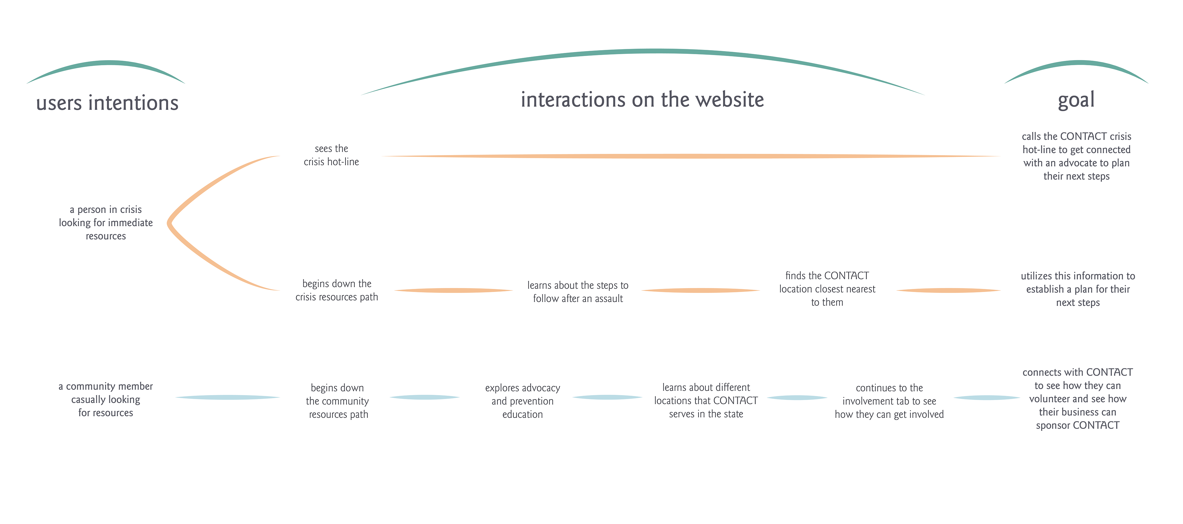
Customer Journey Map
The focus group I conducted alongside senior marketing student Sydni Pierce provided crucial insights that guided the design of the new website and brand. The focus group consisted of many diverse perspectives spanning Black United Students to Greek organizations. The central insights taken from the interview were users thought they had to pay for CONTACT’s services, users felt overwhelmed by the amount of information and use of color, users felt the typography to be cold and not personable, users were confused by the site’s navigation, men did not feel represented within the brand, members of the LGBTQI+ community did not feel represented within the brand, users were off-put by the stock photos on the site.
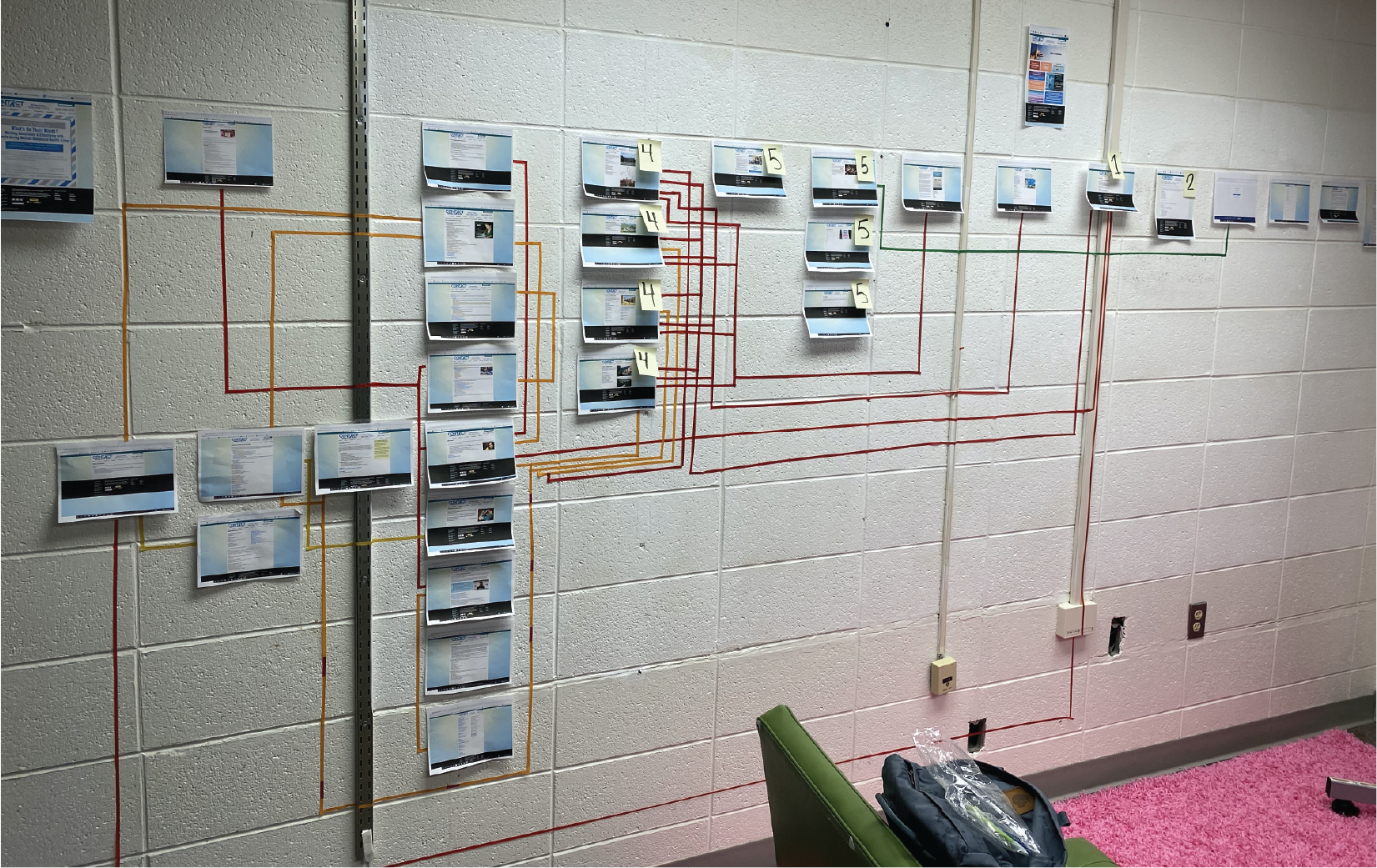
Previous site map
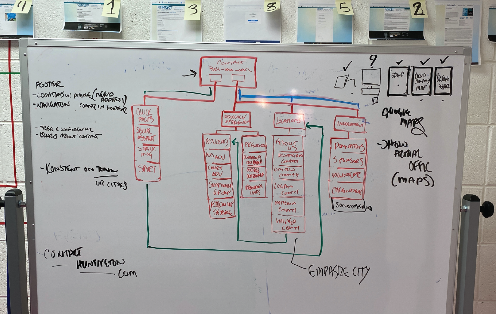
Current site map
To better understand the navigation of the original website I created a site map that showcased the pedigree of the website. Through this, I discovered that the overabundance of navigation options would be very confusing for someone in crisis trying to find information, crucial information would be buried within three pages, the advocacy page was the central endpoint for a majority of the paths, and there was no central place to collect information regarding events held by CONTACT. I utilized this same method as I began constructing the new website and establishing the new user experience for the user.
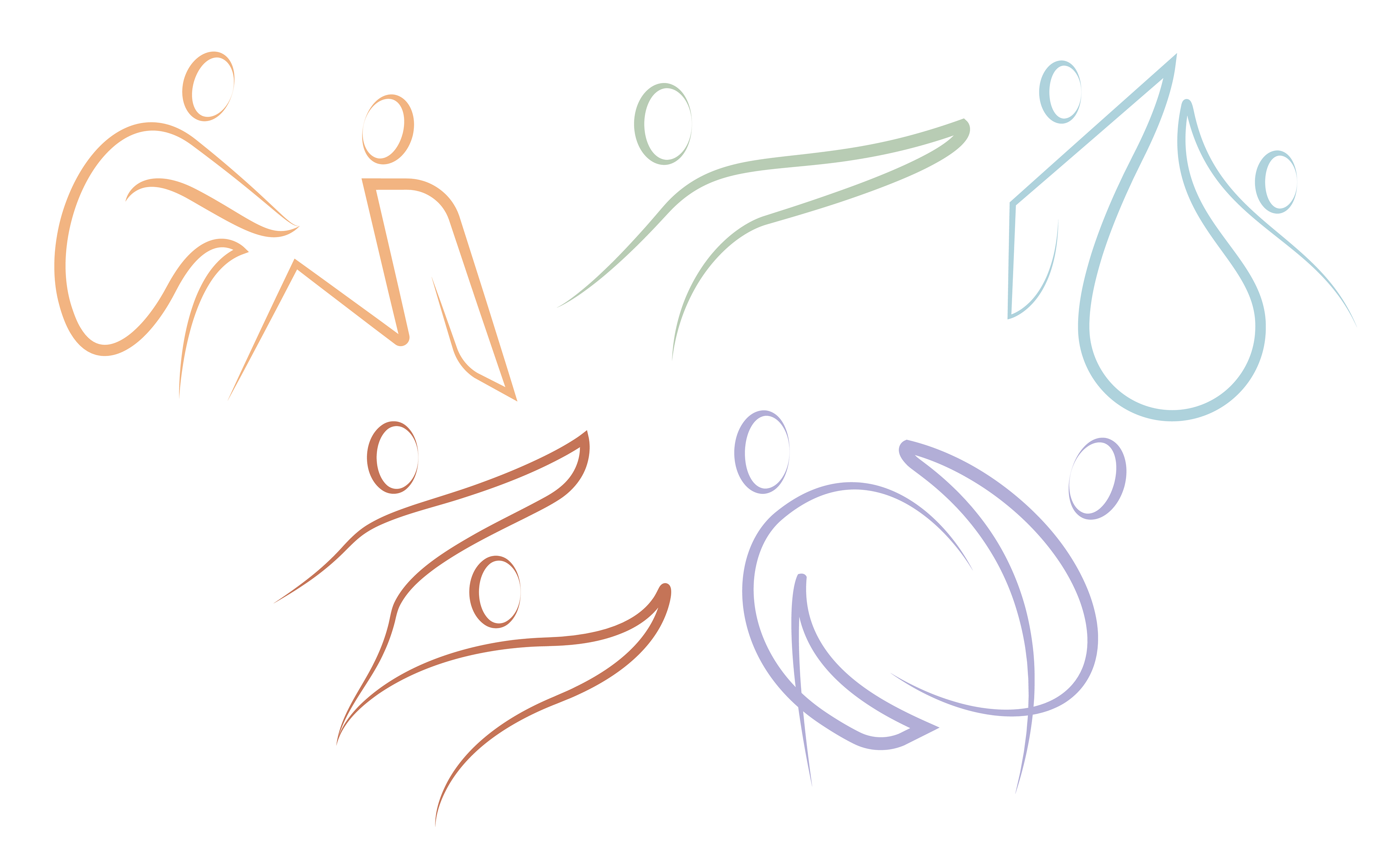
The visuals on the site reference the swooping curves in the logo continuing the continuity of the brand while adding the additional element of human connection to the logo mark. The minimalistic visuals remove gender while still retaining masculine and feminine qualities to give anchors for people to relate to the imagery.
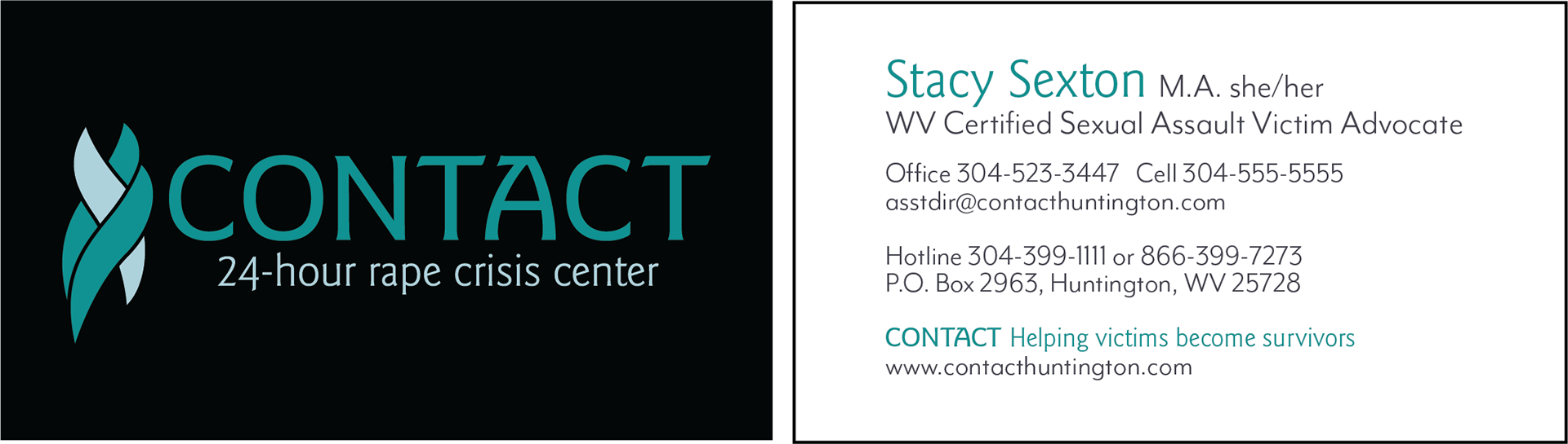
Business Card 2x3.5 in
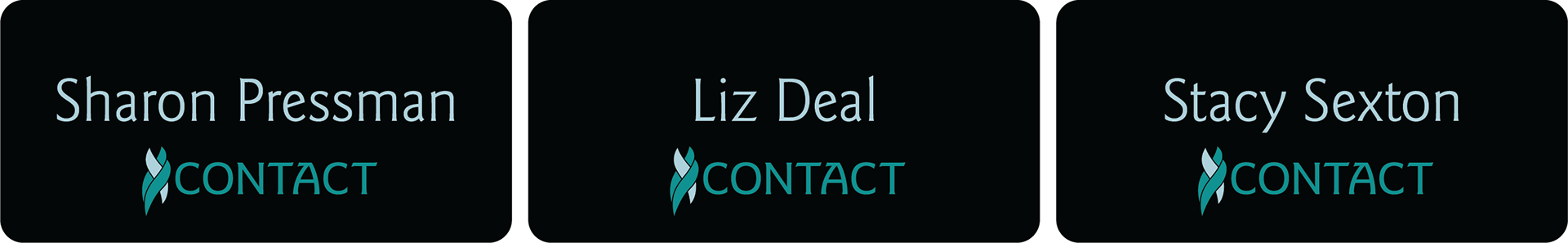
Nameplates 3x1.5 in.
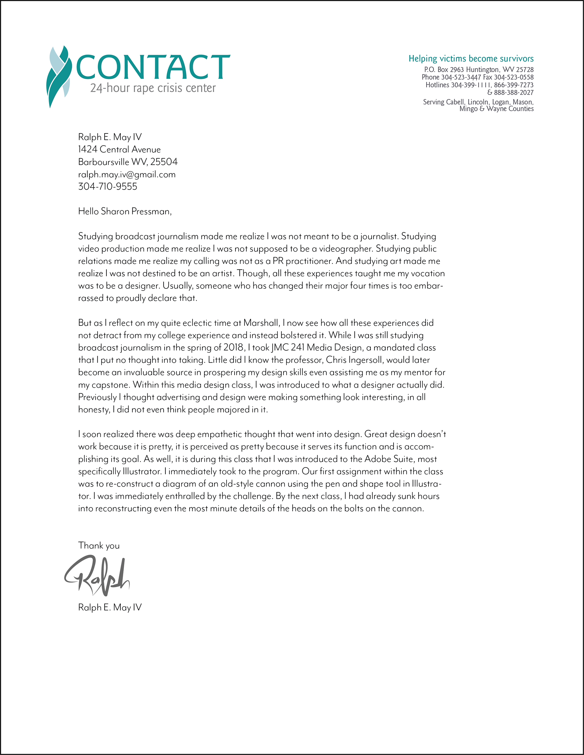
Letterhead 8.5x11 in.
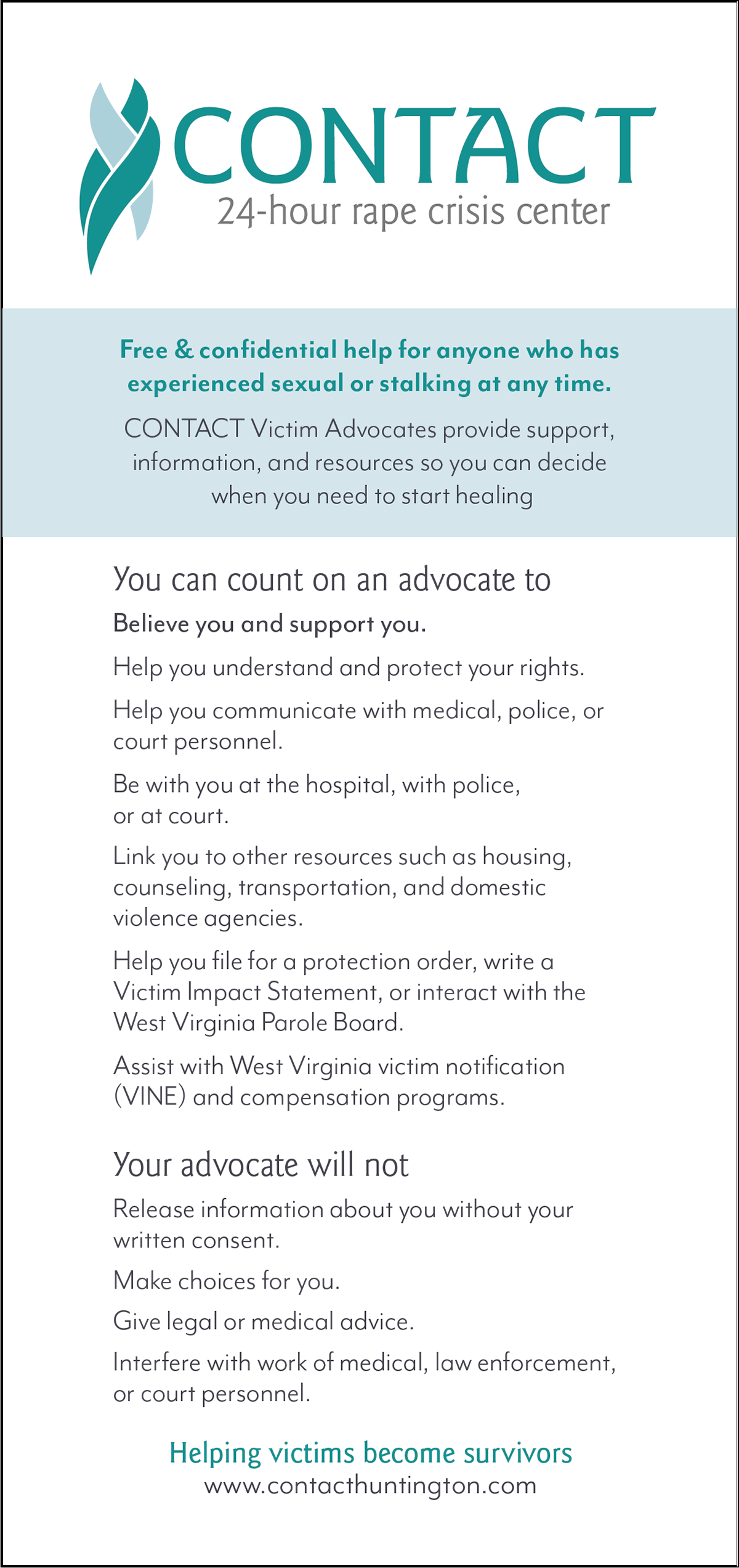
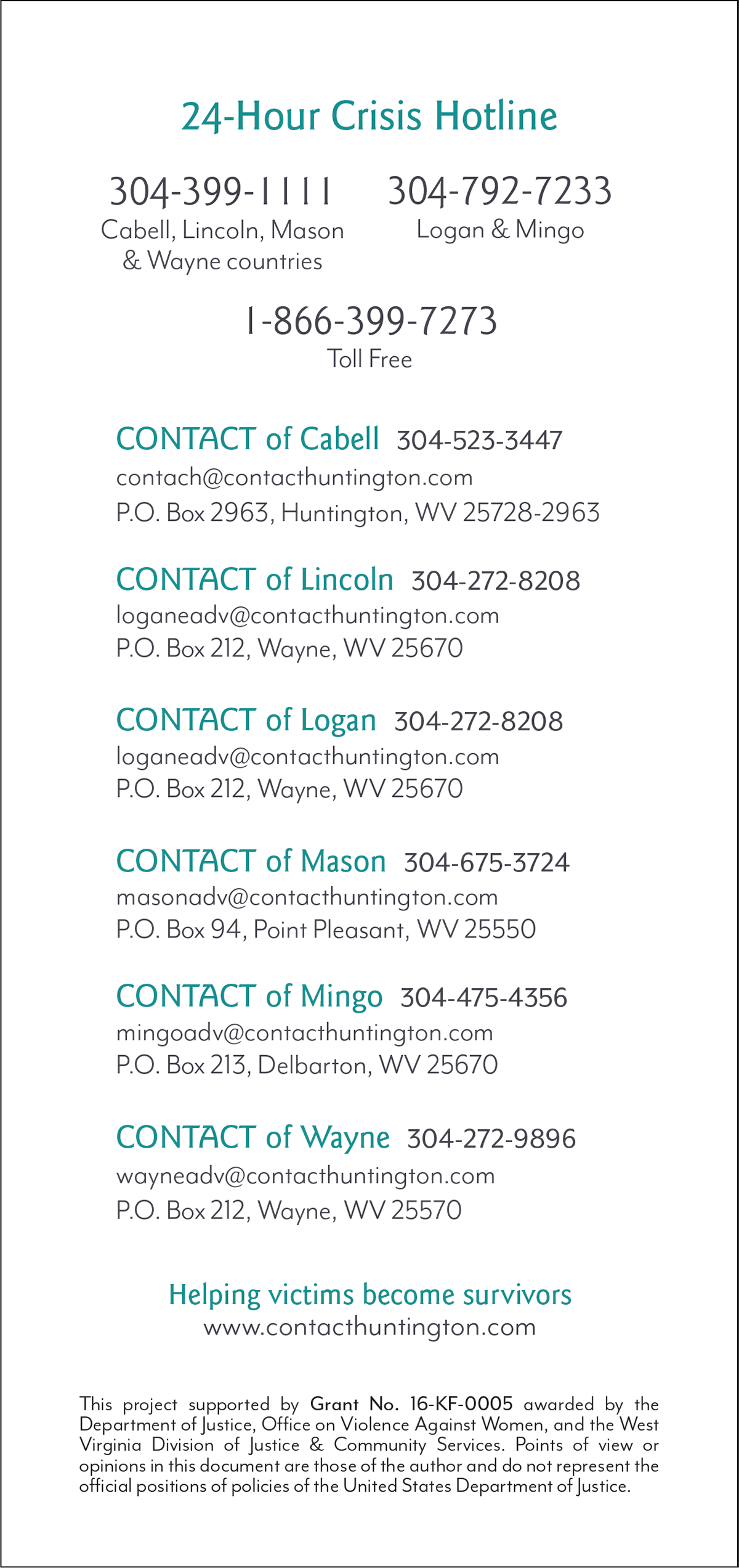
Flyer Card 4x8.5 in.
SOLUTION
Create a new brand and website for the CONTACT Rape Crisis Center.
To address the issue of brand inclusivity, I dialed back the use of photography on the website and incorporated graphics that showcased those same messages of support and comfort while excluding gender. With the typography, I wanted to ensure the typeface was humanistic but balanced with a sense of authority since they want to be seen as an organization that can effectively help victims. The more muted pastel tones of the colors combined with the active white space are meant to create a calming space for users that may be facing a very tough situation.
Through the use of site maps, I reorganized the information into paths designed for different users of the site. The first path is consistent of just crisis resources so someone in immediate need can effectively and quickly get the information they need. The second path gives more in-depth information about advocacy resources and the services that CONTACT offers. The third path, news & events, is designed to disseminate time-sensitive information to community members or sponsors about events or support groups.