
PROBLEM
For class, we were tasked with creating a multi-page document to advertise and promote a fictional app. I interpreted this as a chance to work on user experience design (UX) and user interface design (UI).
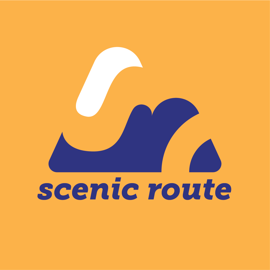

Logo and application icon
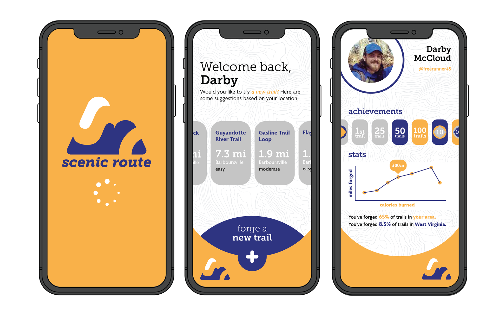
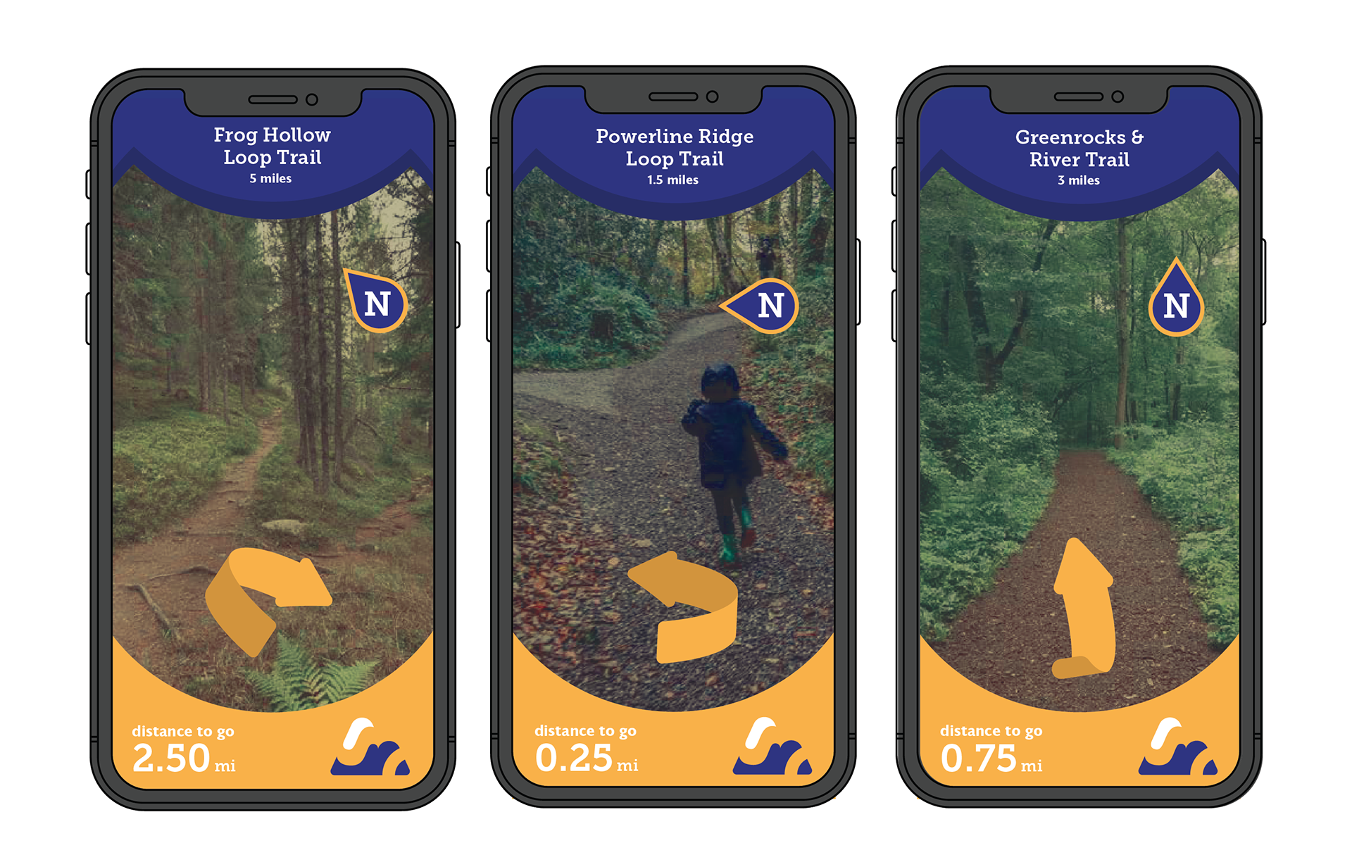
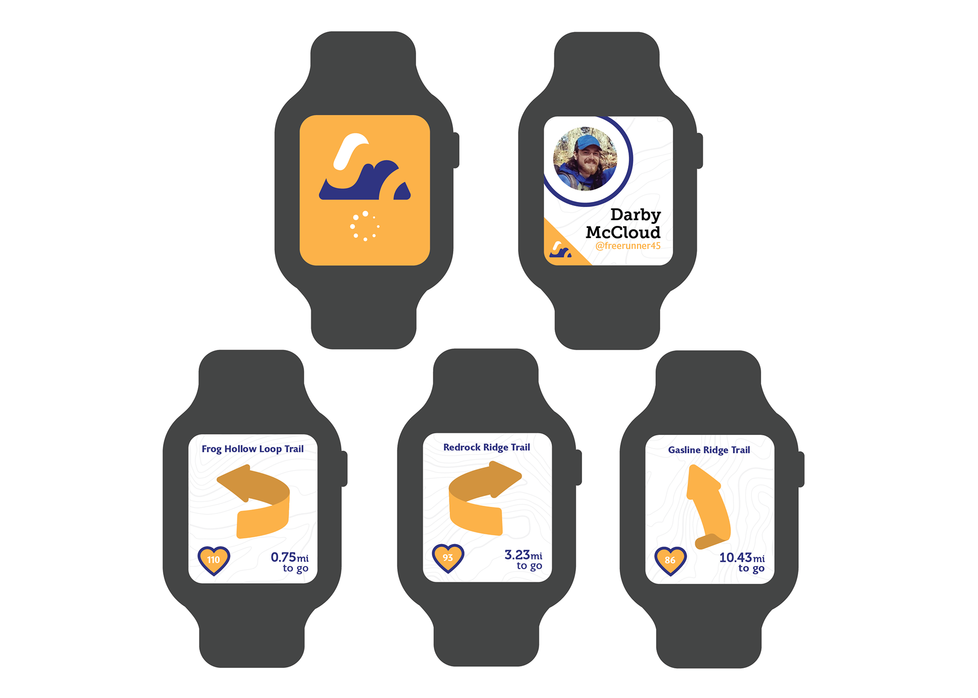
Phone and smart watch app design
advertisements for billboards and magazines
SOLUTION
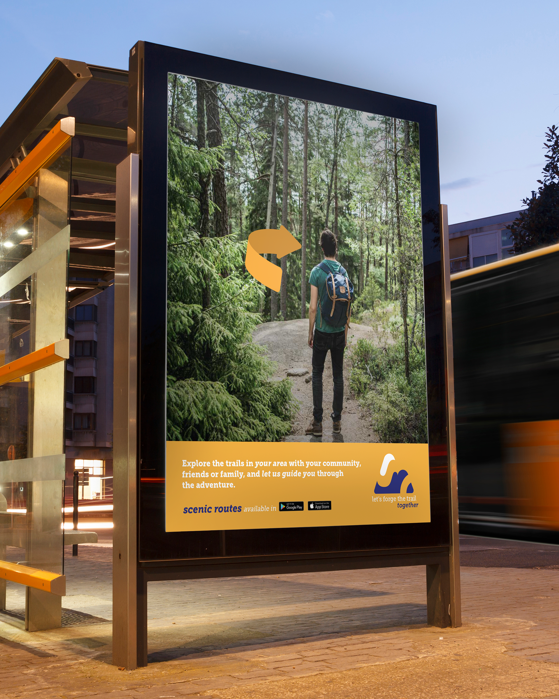
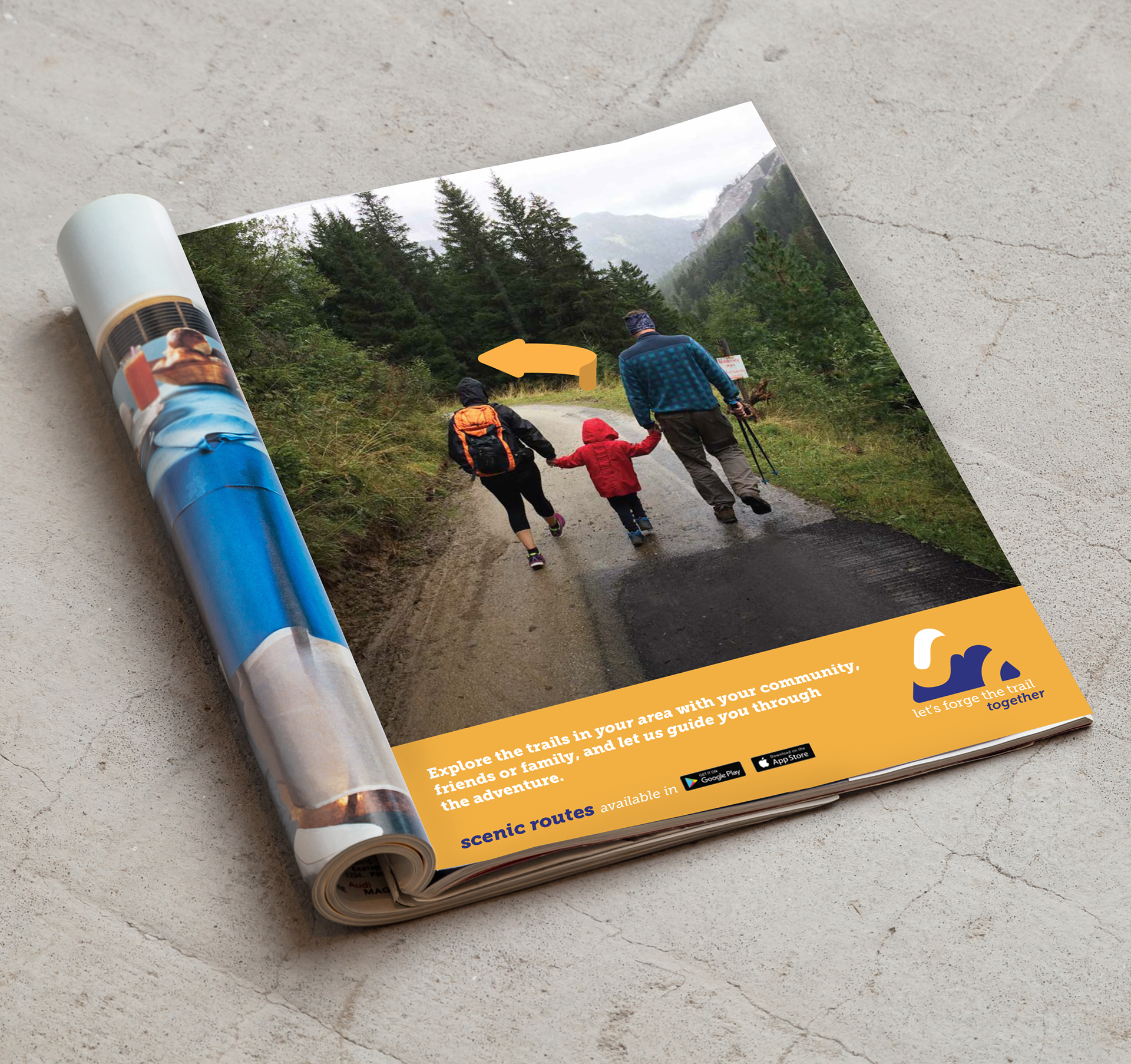
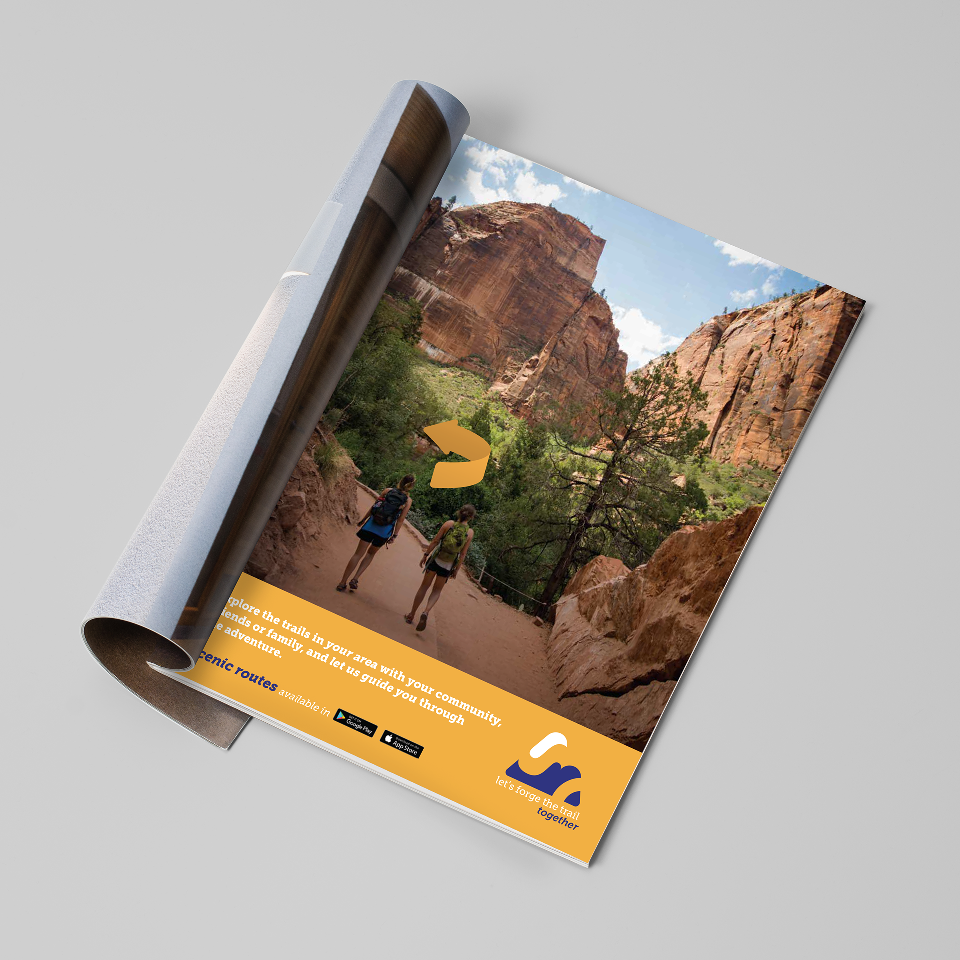
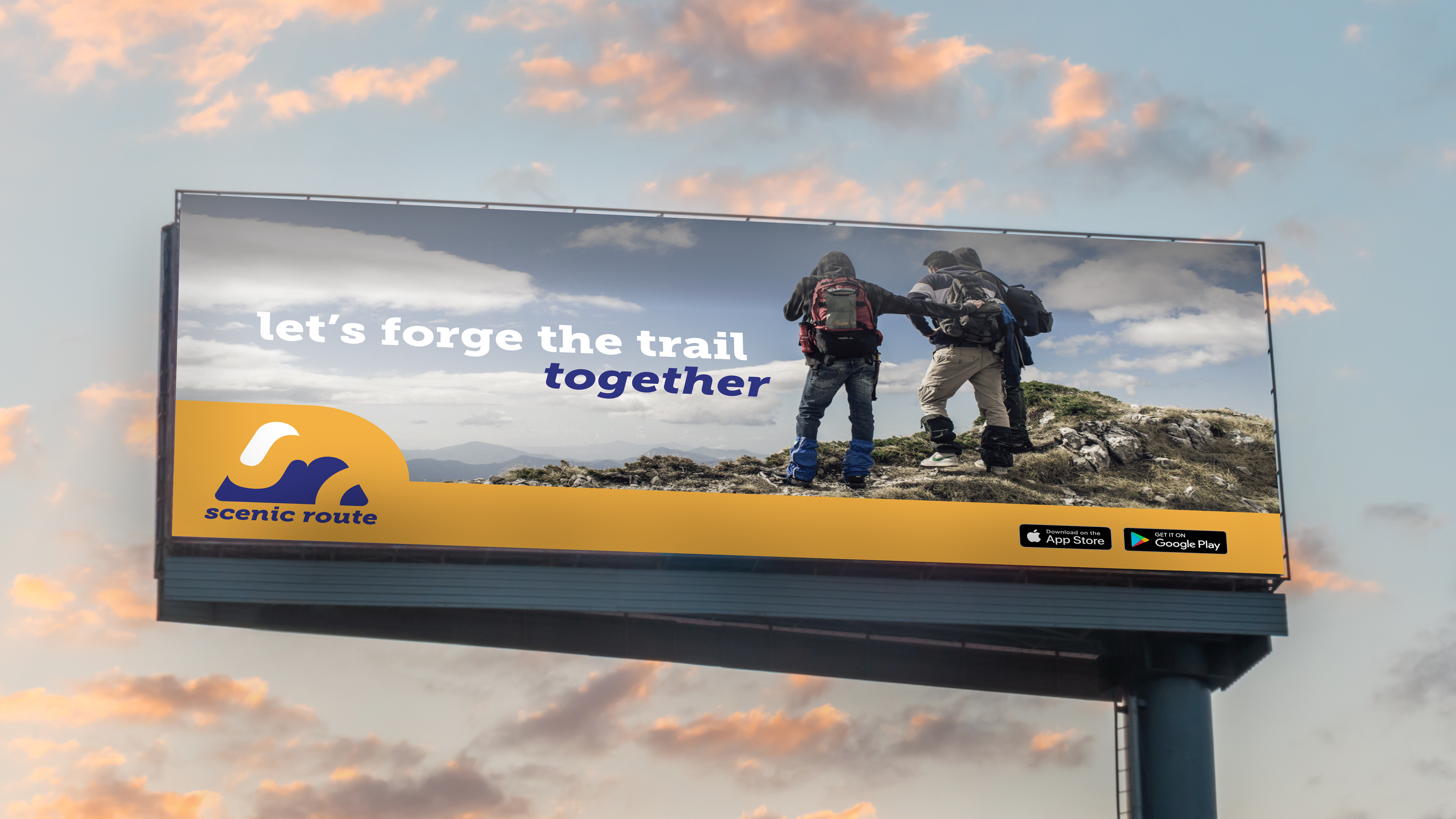
Create a user interface design and accompanying advertising campaign for Scenic Route, a fictional trailway-finding and community building app.
This was the assignment I first chose to explore user experience and interface design. At the time I was interested in hiking and wanted to explore ways that I could make my experience of hiking even more enjoyable. I wanted to find a community to hike with and create a better wayfinding system for the trails. I combined elements of community building and augmented reality to address these needs. With the brand, I wanted it to be bold and fun. I achieved this using the chunky slab serif “Museo Slab” in conjunction with bold contrasting orange and blues. With the logo, I wanted to play with negative space to create a new take on the often-used symbol of a mountain. I kept the “s” of scenic in the negative and the “r” of route in the positive to create that interesting play. The negative space subsequently alludes to trails winding around the mountain.